As anyone who knows me can attest, I’ve loved using Apple computers since long before it became popular. That doesn’t mean I don’t gripe when it’s called for.
Apple prides itself on usability. Way back in the stone age, it even published a manual for developers on proper GUI (graphical user interface). It was groundbreaking at the time, and is still the standard.
Which is why I remain baffled (and griping!) that Apple abandoned parts of its own manual in 2011. That was the year it introduced OS X Lion — and what many of us not-so-fondly call the color vampire.
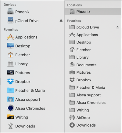
Lion sucked all color out of toolbars and sidebars, along with their distinctive shapes. Buttons that were formerly easy to find were now monochrome squares indistinguishable from other nearby monochrome squares, except for some tiny bit of detailing that didn’t exactly leap out.
Here’s the thing: we humans are predators. Omnivorous predators, to be specific. Our brains are finely tuned through a few gazillion years of evolution to instantly recognize a desired object (or a feared one) by color and shape.
We are not wired to examine a line of monochrome squares and quickly distinguish between them. We can do it, but there’s a time penalty, and it takes more effort.

With the advent of Lion’s color vampire, many of us went searching for hacks to pour the color back in, or gave up on some Apple software and used third-party programs instead. I gave up on Finder and turned to PathFinder, which is the sidebar on the left in the above image. You can see why I’ve stuck with it for the past seven years.
Apple’s new Mojave came out last month with a much-touted revamped Finder. I allowed myself to hope.
Well, there are many things to like in the new Finder, but customization and color are not among them. So I’ll post my gripe, a tiny note on the massive internet wall, and know that it will probably suffocate beneath the blanket of assertions that monochrome is now considered more “professional.” Pah. You can keep your professional; just give me the option to be my throwback self, the omnivorous predator wired to detect colors and shapes.
Back I go to PathFinder. Call me when Apple remembers to use its GUI manual.


Not only monochrome but things smaller too. 😠
Fed up omnivorous predator here – too old to go hunting for polychrome hacks – grumpy at vanishingly smaller fonts. Gripes appreciated.
And it feels far to long to wait a whole 9 days for Alsea book 7 to cheer me up…
The new Finder does allow you to choose icon sizes (but only in 3 of the 4 view options, and of course I’ve always used the fourth), as well as text size. You can also choose larger folders systemwide in System Preferences/General/Sidebar icon size. And you can set your preferred font and type size in Mail. So there *are* options…but not in those dang toolbars.